

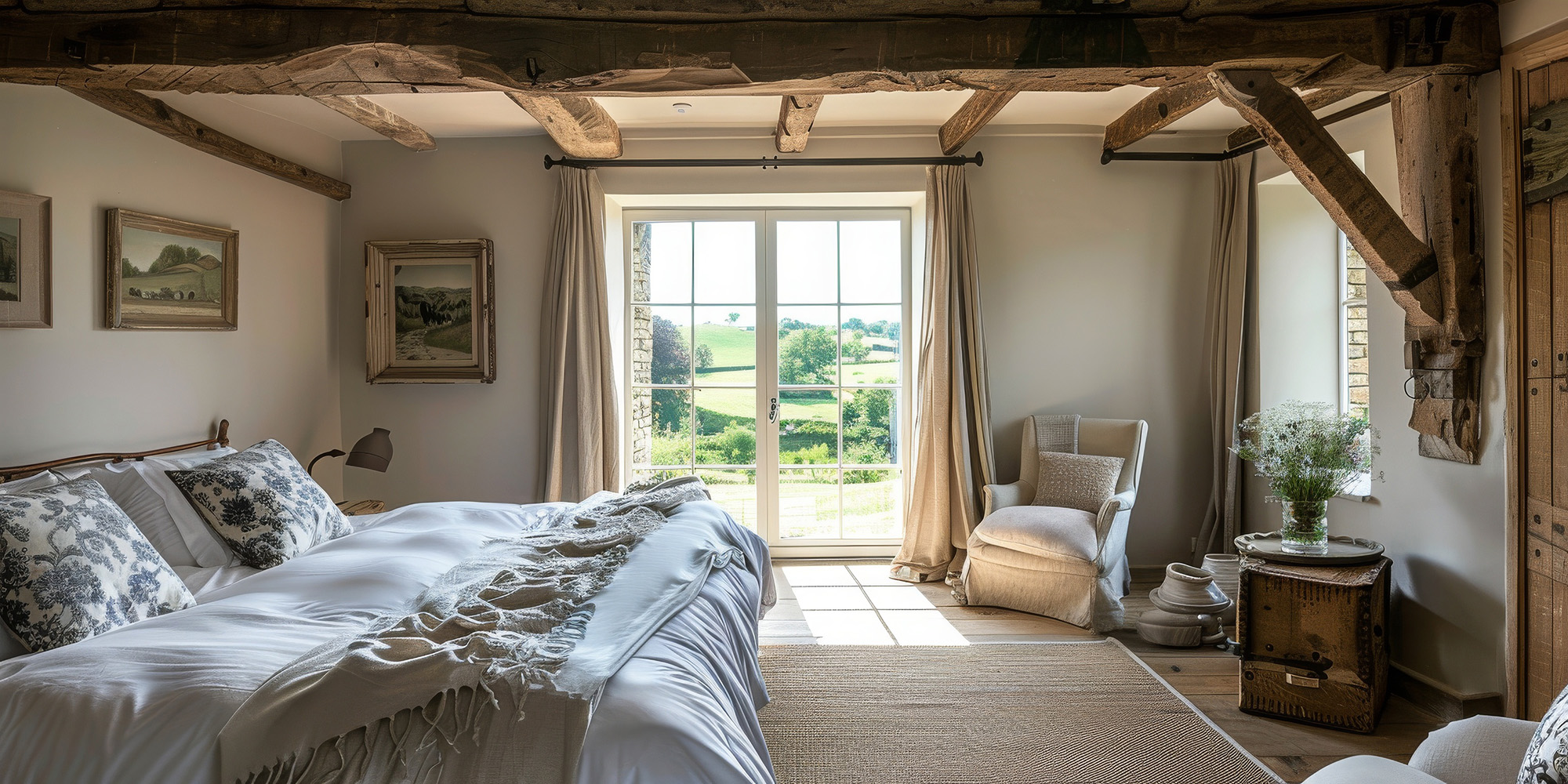
Japandi is the design middle ground where Japanese restraint meets Scandinavian warmth. In Central Texas homes, the challenge isn’t creating “minimal,” it’s creating calm without washing the whole space into a flat beige blur under strong daylight. Flooring does most of the heavy lifting because it’s the largest visual surface, and the wrong undertone or sheen can make a room feel colder, louder, or messier than it should.
Why Texas daylight changes your floor color
High daylight and warm interior lighting can distort neutrals. A “soft neutral” in a showroom can shift to pink, yellow, or gray at home depending on window orientation and surrounding finishes. The Japandi solution is controlled contrast: warm neutral bases, low sheen to reduce glare, and subtle movement so the floor feels alive without becoming busy.
Laminate palettes that feel warm, not dated
Japandi laminate usually works best in light oak and natural oak tones with low contrast grain. Avoid extremes: gray-heavy driftwood reads cold in warm light, and yellow-heavy honey oak can feel loud. Look for a matte or low-sheen finish, subtle embossing that matches the grain pattern, and a repeat pattern that doesn’t scream “copy-paste plank.” Plank width matters too: wider planks can feel calmer in open plans, but very wide planks can look unnatural in smaller rooms.
Tile palettes that feel grounded, not icy
For Japandi tile, stone-look porcelain is often the safest path, but choose warm stone visuals rather than blue-gray. Warm limestone looks, travertine-inspired porcelain with controlled variation, and warm greige concrete looks tend to feel grounded. Matte and honed finishes diffuse light and reduce the “glare grid” effect you get with shiny floors and recessed lighting, especially at night when the room should feel restful.
Texture is how Japandi stays calming instead of flat
Japandi isn’t “no texture,” it’s “quiet texture.” In laminate, that means subtle surface texture that aligns with grain and doesn’t look plastic. In tile, it means microtexture that feels natural underfoot and doesn’t collect grime in deep pits. Too much variation creates visual noise. Too little makes the room feel lifeless. Always view multiple pieces from different boxes or a range board so you understand how the field will actually look across the whole room.
One practical spec section
Choose warm-neutral undertones (oat, sand, warm greige), not cool gray
Prefer matte or low sheen finishes to reduce glare and streaks
Keep grain/stone movement subtle and consistent across pieces
Match grout to tile body tone to keep lines calm
Use slightly darker grout only in high-traffic zones for practicality
For open plans, plan acoustic softness (rugs/pads) so “calm” isn’t echoey
Take samples home and view them morning, noon, and night before ordering
Japandi works in Texas when the palette is warm, the sheen is low, and the texture is restrained, so the room feels calm without turning bland. If you want help narrowing tile and laminate options that match your home’s lighting and your preferred mood, Town Square Floors can guide you through samples and installation planning. Visit Georgetown, TX, and if you’re in Georgetown, Round Rock, Austin, Jarrell, and Liberty Hill, TX, contact us to schedule a consult and get a buyer-ready estimate.


